HOME
ABOUT US
4D Workplace Leadership
District Leaders
District Officers
PQD Extended Team
CGD Extended Team
PR Extended Team
District Communication
District 98 Realignment Committee
Call for Leadership Team
Call for D224 Leadership Team Nominations : 2026-2027
Call for D225 Leadership Team Nominations : 2026-2027
Call for D226 Leadership Team Nominations : 2026-2027
DLC Nominated Candidates
DLC Nominated Candidates for District 224 : 2026-2027
DLC Nominated Candidates for District 225 : 2026-2027
DLC Nominated Candidates for District 226 : 2026-2027
D98 Times
Governing Documents
Audit Committee
Contact us
D98 Luminaries
PROGRAM QUALITY
Contest
Contest Calendar
Contest Kit
Area Contest Winners
Division Contest Winners
District Contest Winners
Judges Pool
Trainers Pool
Leadership Launchpad
Speechcraft
Youth Leadership Program
Club Resources
Pathways
Pathways Overview
Basecamp New Look
Basecamp Detailed Overview
Basecamp Member Guide
Pathways Projects
Club Officer Resources
THE D98 EDGE
CLUB GROWTH
Club Coach
Club Coach Nomination Form
Request a Club Coach
Resources & Guidelines
Club Coach Agreement Form
New Clubs 2024-2025
PUBLIC RELATIONS
Creativity
Memories – Newsletter Edition 2
Century of Voices – Newsletter Edition 1
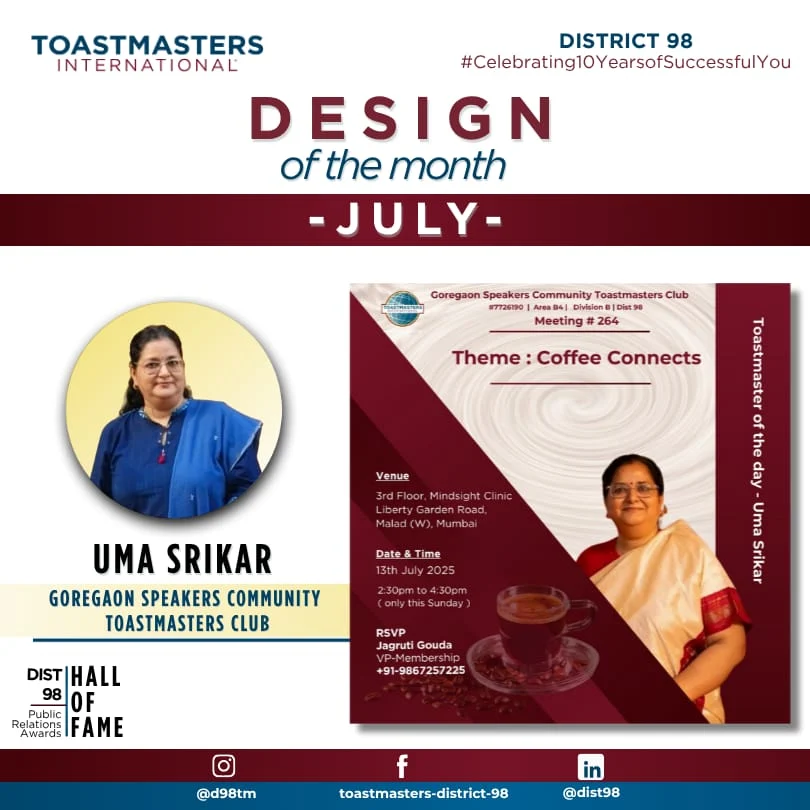
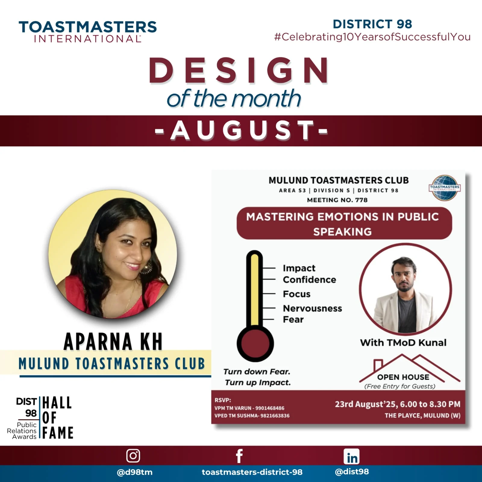
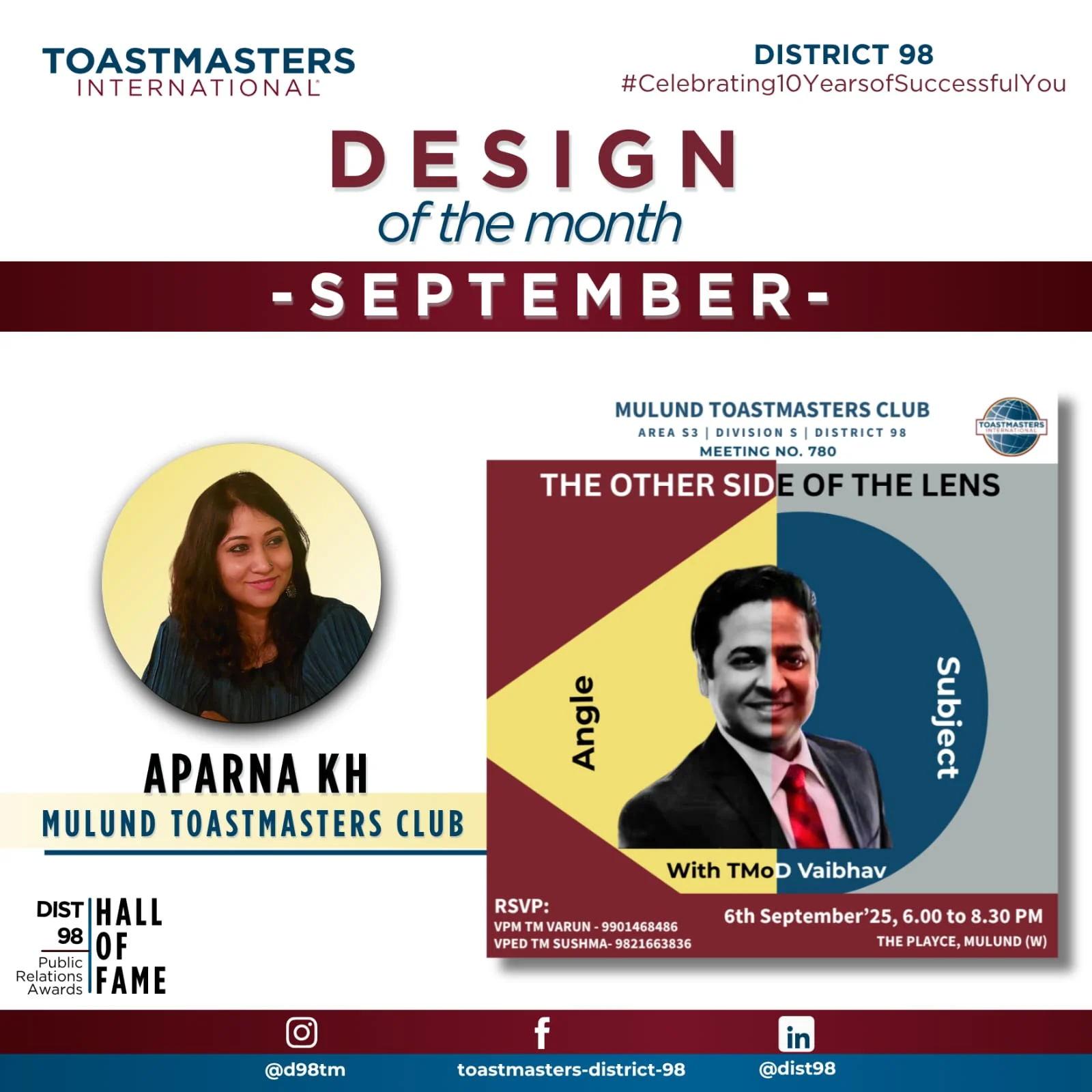
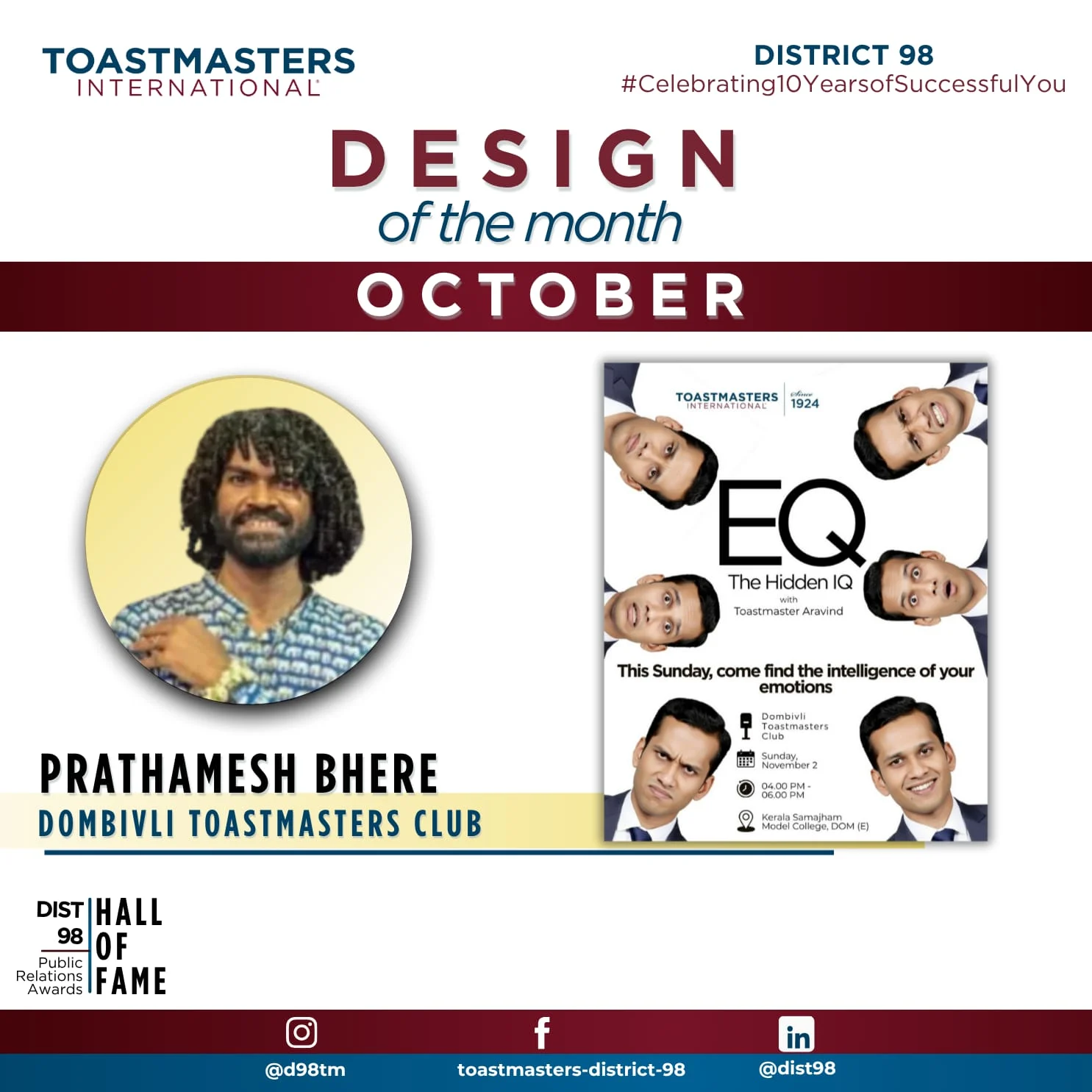
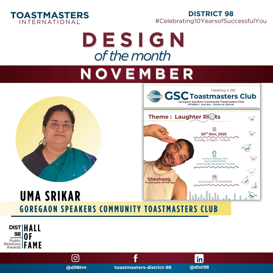
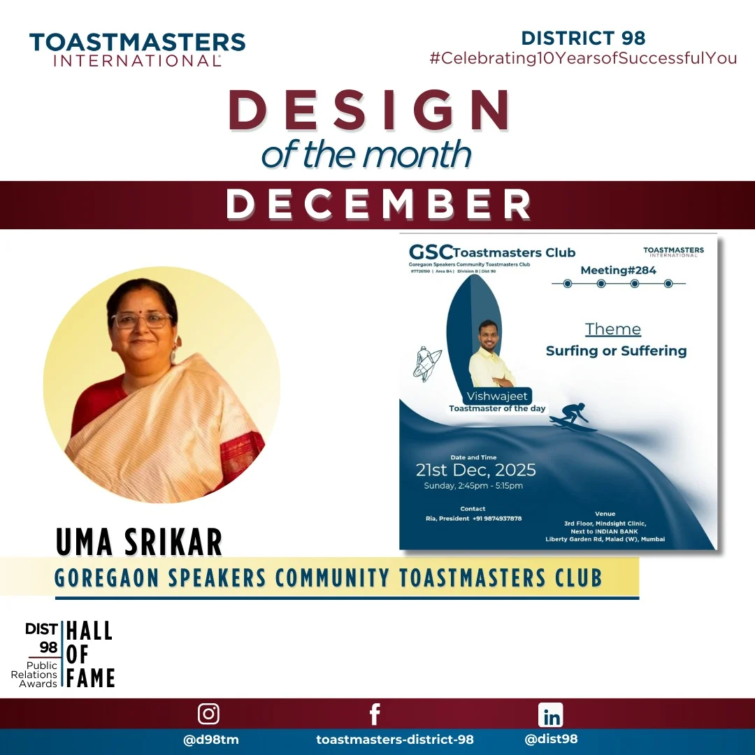
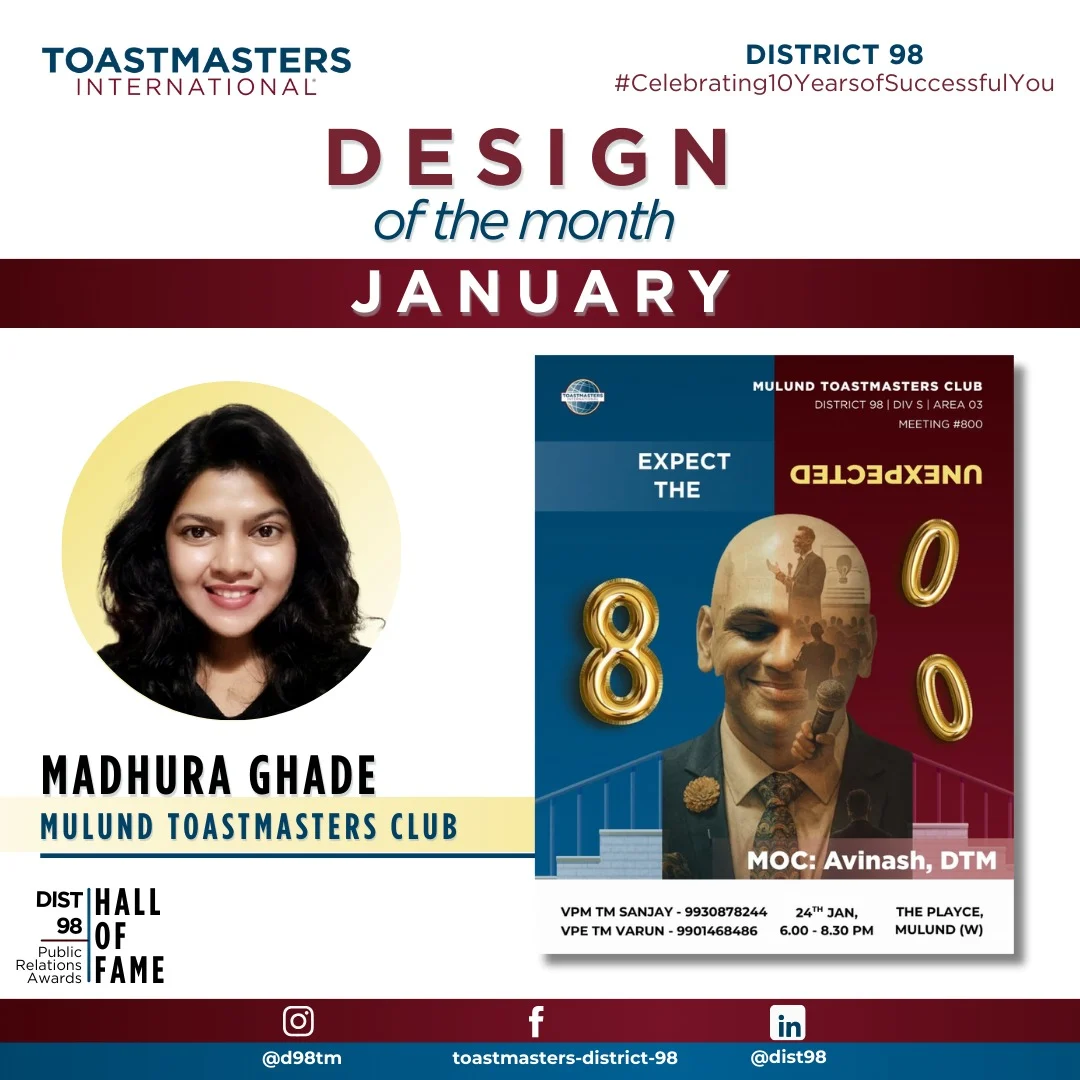
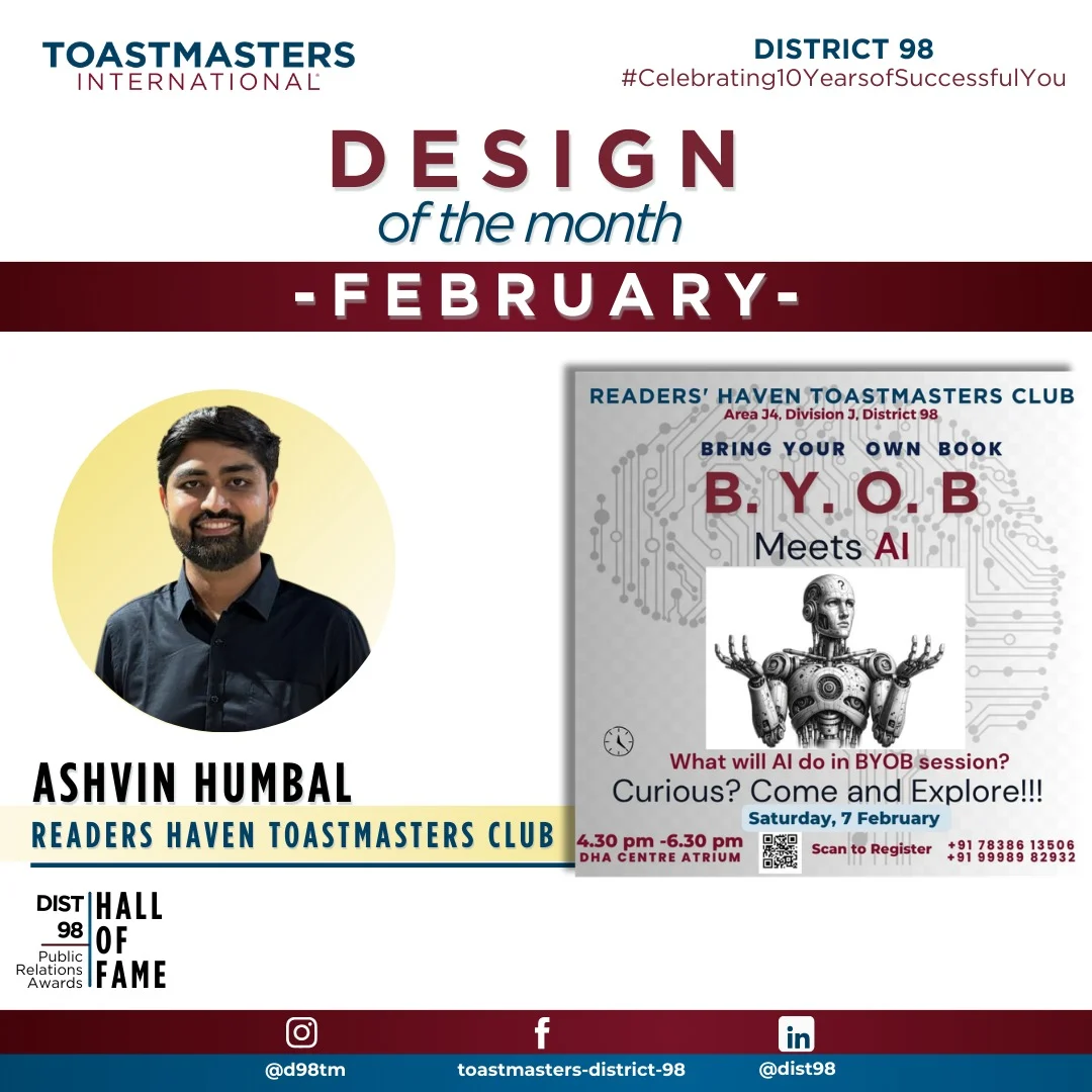
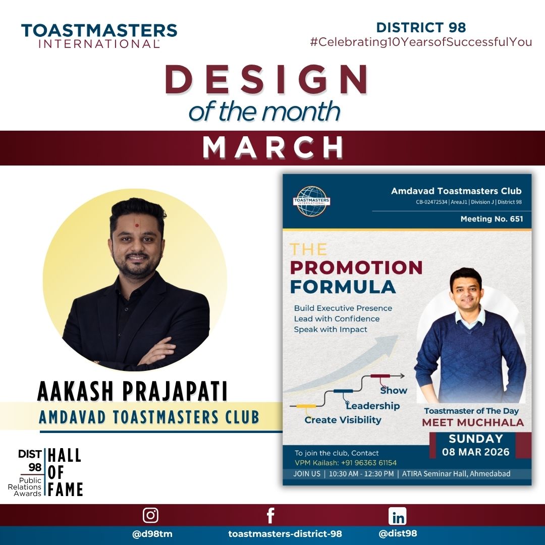
Design of the Month
Engagement Champion
Visual Storyteller
Media Coverage
Our Blogs
Gratitude Reflections
Photography
Podcast of D98
Did You Know?
PR Resources
Member International Feature
AWARDS
Hall of Fame Awards
Gem Awards
Gems Tracker
Awards Timelines
Award Winners
23-24
24-25
2025-2026
ELOQUENCE 2026
HOME
ABOUT US
4D Workplace Leadership
District Leaders
District Officers
PQD Extended Team
CGD Extended Team
PR Extended Team
District Communication
District 98 Realignment Committee
Call for Leadership Team
Call for D224 Leadership Team Nominations : 2026-2027
Call for D225 Leadership Team Nominations : 2026-2027
Call for D226 Leadership Team Nominations : 2026-2027
DLC Nominated Candidates
DLC Nominated Candidates for District 224 : 2026-2027
DLC Nominated Candidates for District 225 : 2026-2027
DLC Nominated Candidates for District 226 : 2026-2027
D98 Times
Governing Documents
Audit Committee
Contact us
D98 Luminaries
PROGRAM QUALITY
Contest
Contest Calendar
Contest Kit
Area Contest Winners
Division Contest Winners
District Contest Winners
Judges Pool
Trainers Pool
Leadership Launchpad
Speechcraft
Youth Leadership Program
Club Resources
Pathways
Pathways Overview
Basecamp New Look
Basecamp Detailed Overview
Basecamp Member Guide
Pathways Projects
Club Officer Resources
THE D98 EDGE
CLUB GROWTH
Club Coach
Club Coach Nomination Form
Request a Club Coach
Resources & Guidelines
Club Coach Agreement Form
New Clubs 2024-2025
PUBLIC RELATIONS
Creativity
Memories – Newsletter Edition 2
Century of Voices – Newsletter Edition 1
Design of the Month
Engagement Champion
Visual Storyteller
Media Coverage
Our Blogs
Gratitude Reflections
Photography
Podcast of D98
Did You Know?
PR Resources
Member International Feature
AWARDS
Hall of Fame Awards
Gem Awards
Gems Tracker
Awards Timelines
Award Winners
23-24
24-25
2025-2026
ELOQUENCE 2026
Design of the months 2025-2026